Constraints
Aspect's legacy product is a 20-year-old call center workforce platform. It schedules contact-center agents, manages time-off requests, and forecasts coverage — the back-office that decides who's on the phone at any given hour. Design hadn't been a priority there; engineering and sales drove what shipped. That changed when a new CEO arrived focused on innovation and Aspect made its first design hire: a designer I'd worked with for years through his agency. He brought me on as product designer #1 in February 2024.
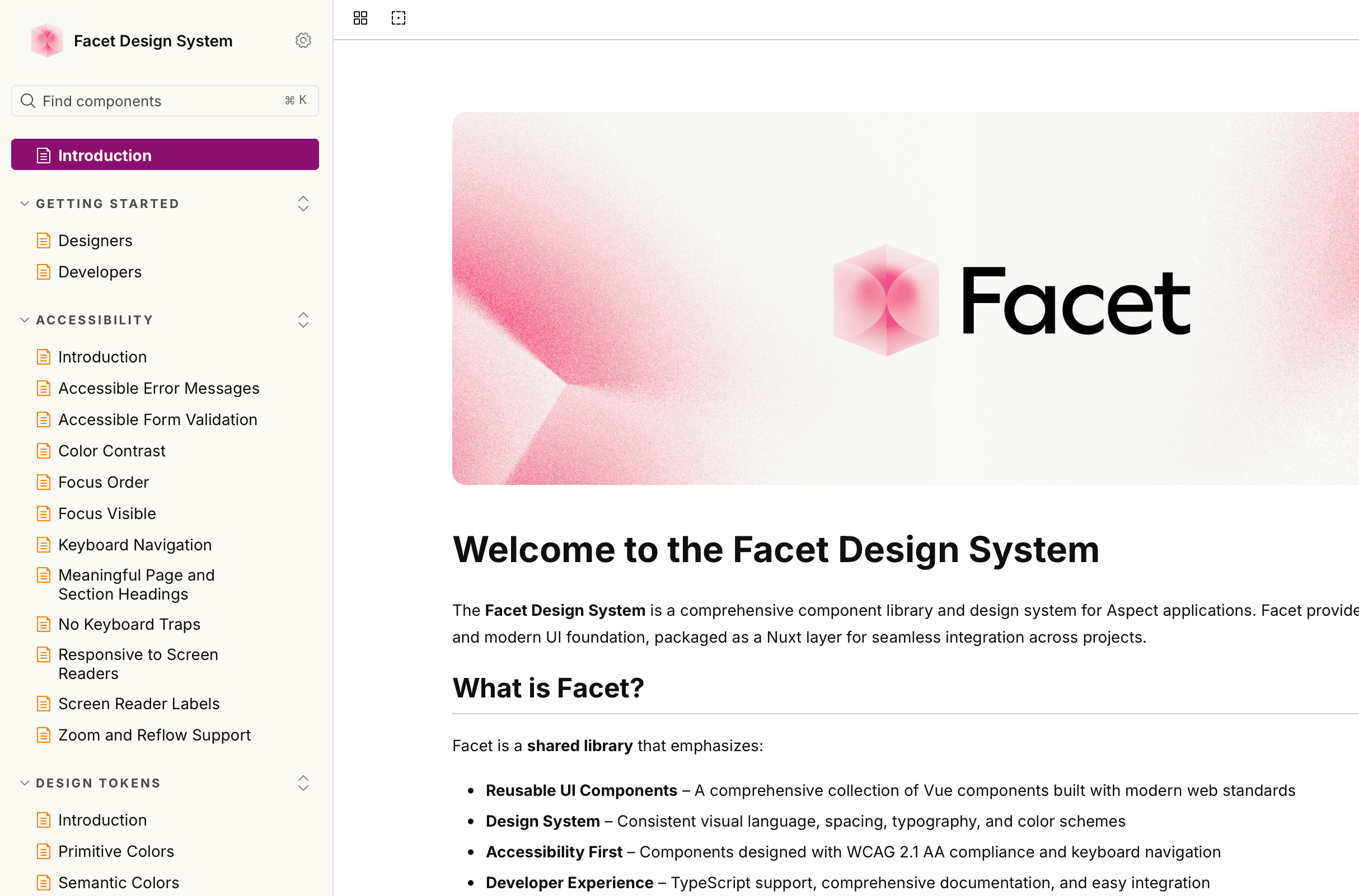
Aspect relaunched its brand in summer 2024: new wordmark, new palette, new positioning. WFX would be the first product built under it, on Vue 3 with Pinia and Vite. There was no Figma library, no token system, no component reference. There had never been a product to build them against.
Through 2024 and early 2025, two other designers joined WFX, each focused on product surfaces. Facet itself stayed mine to drive. By fall 2025 the team had grown to five designers, including a new director of product design hired in June. The system existed for over a year before it had a name.
Building the token plugin
The first practical question was how to keep Figma values aligned with Vue values. The off-the-shelf options each had a tax I didn't want to pay. Tokens Studio worked but added a thicket of concepts I didn't need: modes, theme groups, an opinionated JSON shape, a paid tier. Style Dictionary was a build pipeline I'd have to maintain anyway. Figma's native variables export was still maturing when I started.
So I built my own Figma plugin: figma-token-export. It does one thing. It walks Figma's variable collections, emits a JSON file in the exact shape my Vue build expects, and stops there. No transformation framework, no marketplace, no abstraction over a problem that doesn't exist.
The plugin emits the JSON the Vue build consumes. Storybook reads the same JSON. Tokens that change in Figma propagate through the pipeline and appear in Storybook on the next build. Figma and Storybook stay in lockstep because they consume the same artifact.
The trade: I own this plugin. If Figma changes the variables API, I fix it. That's a cost I'd rather absorb than the cost of fighting someone else's mental model.
Primitives and semantics
The token layer ships in two tiers. Primitives are the alphabet: raw scales like purple-700, neutral-300, green-500, spacing-04 (16px). Designers don't touch them.
Semantics are the working API. Every context in product UI gets its own token, even when several alias to the same primitive:
bg-interactive→purple-700for surfacestext-link→purple-700for typeborder-interactive→purple-700for bordersicon-interactive→purple-700for icons
Four tokens, one primitive. It costs more to maintain than naming the color purple-700 and using it everywhere. The cost buys two things.
First, context is enforced by name. You can't accidentally use a text color as a border, because they have different names. border-success is for borders. text-success is for type. They alias the same green primitive, but the system blocks the cross-context misuse that produces design debt over time.
Second, the brand can change without rewriting product code. When the interactive purple shifts a shade, the semantic doesn't move. Every screen using bg-interactive resolves to the new value automatically. Engineers never see the primitive name in product code, just the semantic.
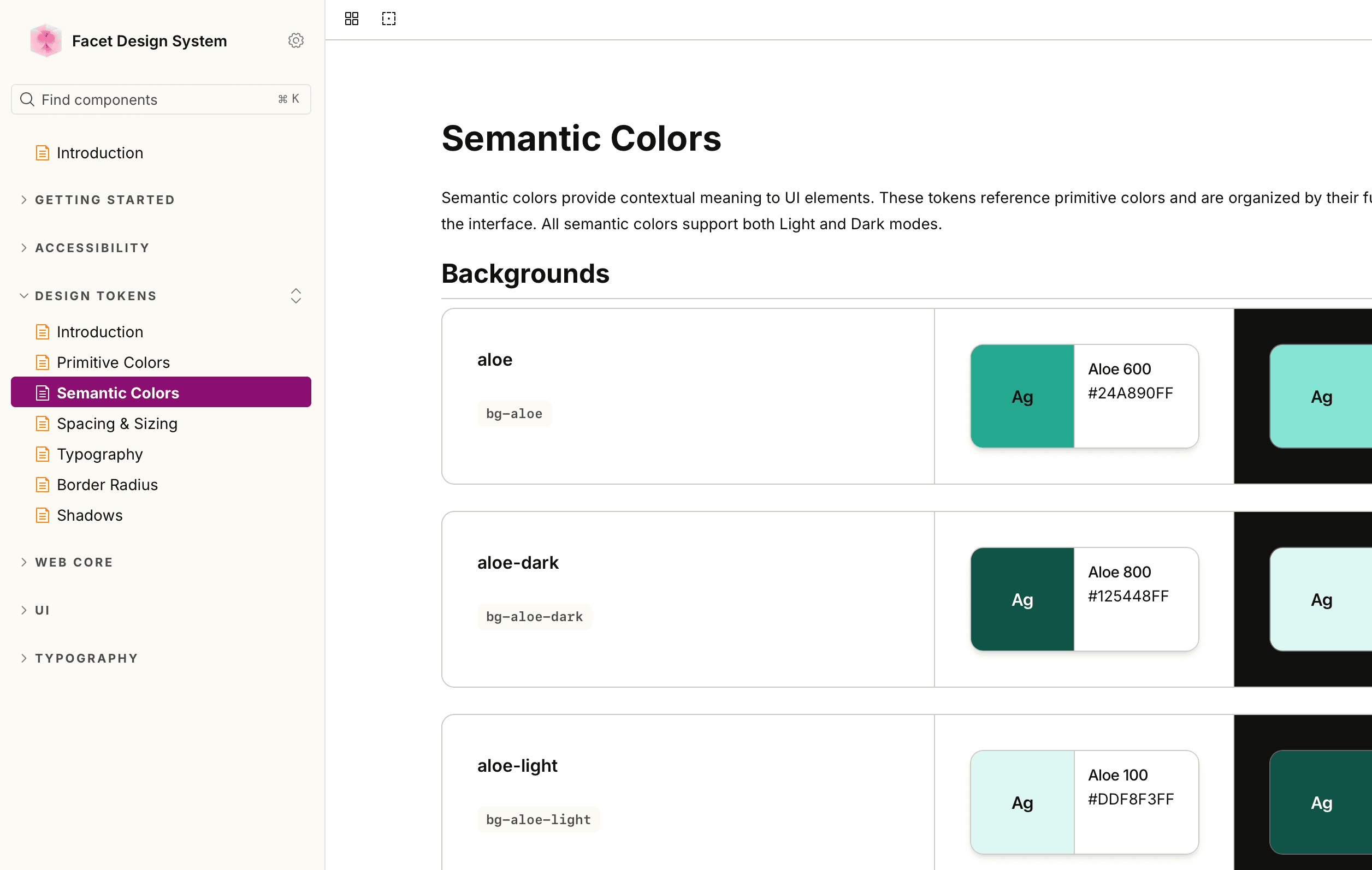
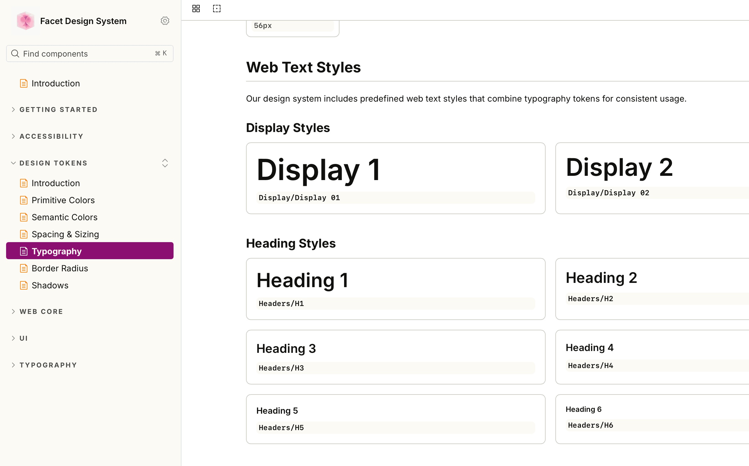
About 450 tokens total. Color splits into background, border, icon, and text categories — each with status, brand, and context variants for calendar schedule blocks and chart data viz. Plus type, spacing, shadows, and radius (the last two sharing the spacing scale: rounded-md aliases spacing-02, so an 8px radius and an 8px gap are the same primitive).
Modes pull double duty: Light/Dark on color tokens for theme switching, Desktop/Mobile on type tokens for responsive sizing. One mechanism, two distinct concerns.
shadcn/vue, not from scratch
The Vue component layer was the next decision. I could have built every primitive (Button, Input, Dialog, Combobox) from divs and ARIA attributes. The teams that do this end up either re-discovering solved problems quarter after quarter, or living with subtle keyboard-trap and screen-reader bugs forever.
We started from shadcn/vue: copied source, not installed as a dependency. The components live in our codebase, restyled with Facet tokens, owned by us. shadcn isn't “the design system”; Facet is. shadcn is a starting library of well-built primitives we modify, version, and extend without negotiating against an upstream maintainer.
The trade: forking copy-paste source means our updates are manual. We accepted that. Building Combobox from scratch was going to lose three months we couldn't afford.
Naming the system
For more than a year, it was called yux — short for “yellowfish UX,” after the codename for what would become WFX. The name worked internally and nowhere else. We renamed it Facet in fall 2025, in a brainstorm with the design team that had grown around it. I liked Facet because it played on Aspect — faces of an aspect, a particular view of the same thing — and felt small and confident rather than systems-engineering-grand.
Other names we considered: Fig (too close to Figma), Prism, Echo, Chord (all already taken by other design systems).
Naming a system after it's already in production is a different exercise than naming one before. By fall 2025 we knew what it actually was. The brainstorm was about confirming, not deciding.
What I cut
Calendar block semantics. WEM, the legacy product, lets admins paint any color on any schedule activity. Twenty years of customer-configured meaning, no shared vocabulary across deployments. I wanted a canonical token layer for calendar blocks: color tokens that captured “scheduled break” or “coverage gap” semantically, so any reskinned legacy deployment could resolve them locally without designers having to think about every customer's palette.
I cut it for V1. The taxonomy needed SME input I didn't have, and shipping the rest of Facet was a higher-leverage move than waiting six weeks for calendar discovery. The base palette — work, break, discretionary, non-discretionary, neutral, other, uncategorized, container — went in a later release once those conversations started. The customer-mapping layer that resolves an admin's custom activity name onto one of those semantic types is still ahead of us.
Where it is now
30–40 components in production. Every screen in WFX uses Facet; there is no “outside Facet” in WFX. The token plugin runs as part of the design workflow, and engineers don't write hex codes anymore. The team that built it: me through most of the first year and a half, then one other designer who joined after critical mass landed in late summer 2025.
Facet is now being carried into WEM, Aspect's flagship product on a 20-year-old Less + jQuery + Knockout codebase. That's its own case study.
What I'd do differently
The bigger gap wasn't on the design side. Other designers were on WFX, consuming Facet day-to-day, and I knew what to design. The bottleneck was on the engineering side. I had close partners on the Vue implementation, but no one dedicated to reviewing the code or the API decisions on Facet itself. Every component, every token, every prop signature was solo until someone else happened to have the time. Shipping efficiently got hard in a way the design side didn't.
I should have pushed for an engineering counterpart from the start, instead of treating that as something to share later. The work is fast when there's one other person whose job overlaps with yours. It's slow in a way that's hard to feel in the moment when there isn't.